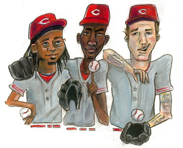
This is the SlydePress 2013 Redleg Annual, an eBook previewing the 2013 Cincinnati Reds. I created the illustration for the cover, and lots of wonderful writers contributed articles. It's available for purchase at redlegannual.com.
Today I thought I'd do a post about my process, because, well... I've never really done that before. We start with a thumbnail, a tiny quick sketch to just map things out:
At the thumbnail stage, the editor hadn't settled on exactly what image he ultimately wanted illustrated, so I also created a thumbnail at the same time for a drawing featuring hitters. Even though we moved forward with the pitchers, I liked that hitter one enough that I went ahead and finished it for my own personal use. Anyway, back to this illustration. So after we settled on that thumbnail, I started working a little larger, and at the same time tightened up and refined the drawing a little bit:
At this point, we need some introductions for the non-baseball fan readers, as I'll be referring to these guys by name. From left to right on the sketch above, that's Mat Latos, Aroldis Chapman, and Johnny Cueto. So after seeing this sketch, the editor suggested switching Latos and Cueto, because Johnny Cueto is actually quite a bit shorter than the other two, and it would be awkward for him to be leaning on Chapman like that. Hence, the next sketch:
I originally tried out smiling Cueto, because he really is quite smiley in real life, but it wasn't right for the intensity of this image. So, goodbye smile, hello funky eyebrows:
I should mention that I make liberal use of tracing paper throughout my drawing process, from thumbnail to final sketch, so I don't have to completely re-draw the image every time I make a small change.
At this point the editor pointed out that we had another height issue: Latos is actually taller than Chapman. Instead of retracing the whole thing at this point, I just used some Photoshop trickery to stretch Mat a little bit:
I cleaned it up a little in the last drawing I did to get ready for color. I transfer the drawing by completely covering the back of my last, best, neatest tracing paper drawing with pastels. The color I choose is different every time depending on the colors I plan to use in the drawing and the color of the paper I'm using. This time I went with brown, which showed up quite well on the white paper. I then tape that on top of my drawing paper. I use Colourfix coated pastel paper, which has quite a bit of tooth to it, almost a sandpaper-y feel. It's able to hold up to several layers of pastels:
Next, I trace over my own lines on the top shet with a pencil, and when I remove the tracing paper, voila! I now have lovely brown pastel outlines on the Colourfix paper to guide my drawing from here on out:
At this point I'm working on my awesome turquoise drawing desk, which my parents found at the World's Longest Yard Sale several years ago and very kindly bought for me. I'm pretty sure it was handmade by someone, so therefore I'm pretty sure it's one of a kind. Which is awesome. Anyway, I tape up a version of the drawing next to me for reference, in case I traced anything badly or lose any of my lines as I work:
One of the cool things about pastels is how easily they blend and smear together. But that's also a challenge. In other media, you can work all over the page at once, in whatever order you like. With pastels, you want to avoid smudging the parts you've finished, so you have to be very intentional about moving across the page. This doesn't mean you can't go back and make little changes here and there afterward, but you need to be very careful. Since I'm right-handed, I always start on the left/top and work my way to the right/bottom:
I use a mix of chalk pastels sticks and pastel pencils. The flat pastels are Prismacolor NuPastels. The pastel pencils are an unholy assortment of brands, picked up in sets and as individuals over the years, including General's, Conté, Stabilo CarbOthello, and Faber Castell Pitt pastels. I generally use the sticks for laying in large swathes of color and the pencils for details.
After the above, I went over the whole face with a more appropriate skin color, blended everything, then used a lighter color (or two or three) to pull out highlights for a little depth.
I also really love lines and tend to grow attached to them in the drawing stages. I'd hate to discard some of those lines even after I have color that gives my image shape and form, so I always work with some kind of outline in the finished piece. I also like to add depth with a little stray crosshatching or other pattern. The outline's not always as dark as this. Often, I use lots of different colors from elsewhere in the image (examples here, here, and here).
Anyway, we're almost done now. Once I get to a point where I'm happy to step away (sometimes I have separation anxiety and want to keep working on it, perfecting the littlest details for way too long) I then scan the illustration and do a little color and value correction in Photoshop to make sure everything's good to go. And there you have it! Finished:

If you made it this far, congratulations! You win a cookie. And I hope you enjoyed your peek into my process.


No comments:
Post a Comment